
KVADRAT is a creative space where artists and designers meet to share ideas. This rebrand turns its floor plan into an identity that feels open, minimal, and welcoming.
KVADRAT is a creative space where artists and designers meet to share ideas. This rebrand turns its floor plan into an identity that feels open, minimal, and welcoming.
3 weeks
3 weeks
3 weeks
Figma, Illustrator, Photoshop
Figma, Illustrator, Photoshop
Figma, Illustrator, Photoshop
Rebranding, UI Design, Copywriting
Rebranding, UI Design, Copywriting
Rebranding, UI Design, Copywriting

KVADRAT had a strong community and no clear identity. I started by listening to the team, and the answer was already there: a home for ideas, where people feel free to grow. The rebrand makes that visible.
KVADRAT had a strong community and no clear identity. I started by listening to the team, and the answer was already there: a home for ideas, where people feel free to grow. The rebrand makes that visible.
KVADRAT had a strong community and no clear identity. I started by listening to the team, and the answer was already there: a home for ideas, where people feel free to grow. The rebrand makes that visible.

The logo starts from the space itself: its floor plan. A square replaces the letter D in the name, and read from above it becomes a room with an open door, an entrance that invites people in. The idea is literal and symbolic at once. It shows what KVADRAT physically is, and says what it stands for: openness, a place anyone can walk into. Because it's so simple, it works at every scale, from signage to stickers.
The logo starts from the space itself: its floor plan. A square replaces the letter D in the name, and read from above it becomes a room with an open door, an entrance that invites people in. The idea is literal and symbolic at once. It shows what KVADRAT physically is, and says what it stands for: openness, a place anyone can walk into. Because it's so simple, it works at every scale, from signage to stickers.

The palette is built around four colors, each with a role. Black brings depth, strength, and clarity. Electric blue is the visionary spark, used sparingly so it always stands out. Light gray gives a neutral balance, and white leaves the space for creativity. For type, PP Editorial New Ultralight gives headlines an airy, editorial elegance, Neue Haas Grotesk keeps longer text clear and readable, and Inconsolata adds quiet technical details. Together they feel minimal, confident, and open.
The palette is built around four colors, each with a role. Black brings depth, strength, and clarity. Electric blue is the visionary spark, used sparingly so it always stands out. Light gray gives a neutral balance, and white leaves the space for creativity. For type, PP Editorial New Ultralight gives headlines an airy, editorial elegance, Neue Haas Grotesk keeps longer text clear and readable, and Inconsolata adds quiet technical details. Together they feel minimal, confident, and open.

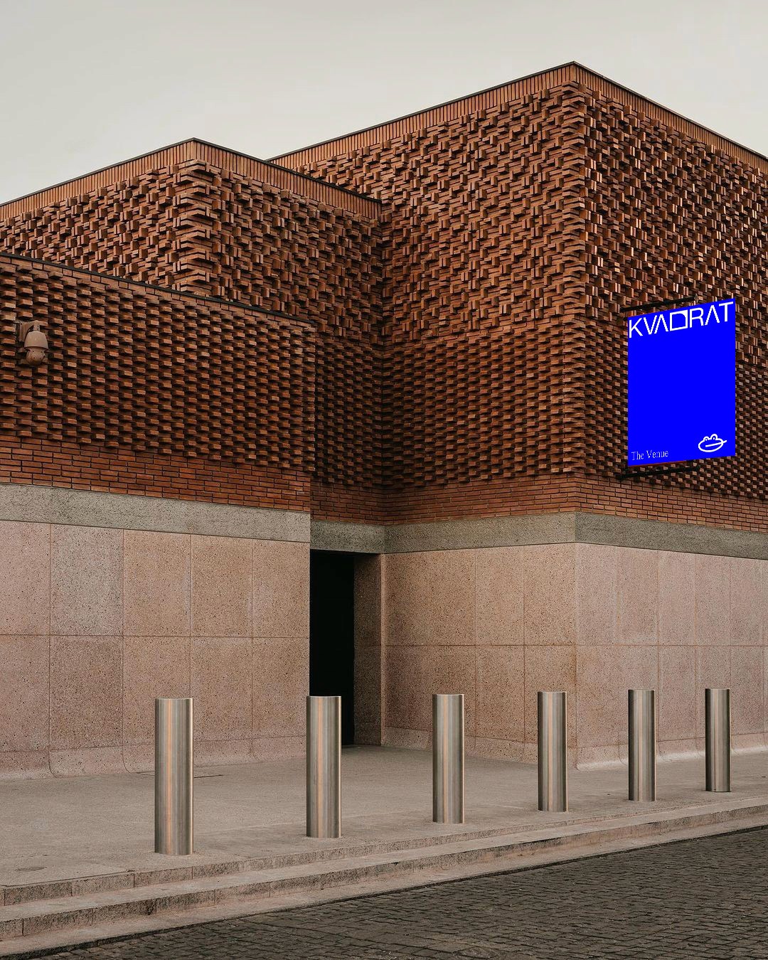


The brand speaks the way the space feels: warm, clear, and human. No jargon and no big promises, just simple language that invites people in. The tagline "Room to Grow" sums it up. It's about physical room for artists to work and exhibit, and room for ideas, people, and the community to develop over time. It's a place where nothing has to be finished yet.
The brand speaks the way the space feels: warm, clear, and human. No jargon and no big promises, just simple language that invites people in. The tagline "Room to Grow" sums it up. It's about physical room for artists to work and exhibit, and room for ideas, people, and the community to develop over time. It's a place where nothing has to be finished yet.


I had full creative freedom on KVADRAT and worked side by side with the people behind it. That let me build the brand from the inside out, so it feels like theirs and not something added on top.
I had full creative freedom on KVADRAT and worked side by side with the people behind it. That let me build the brand from the inside out, so it feels like theirs and not something added on top.
I had full creative freedom on KVADRAT and worked side by side with the people behind it. That let me build the brand from the inside out, so it feels like theirs and not something added on top.
This is a student project created for educational purposes. All imagery is used strictly for non-commercial use. Certain images were obtained from Cosmos.com and remain the property of their respective owners.
This is a student project created for educational purposes. All imagery is used strictly for non-commercial use. Certain images were obtained from Cosmos.com and remain the property of their respective owners.
This is a student project created for educational purposes. All imagery is used strictly for non-commercial use. Certain images were obtained from Cosmos.com and remain the property of their respective owners.